


bird and insect
bird and insect
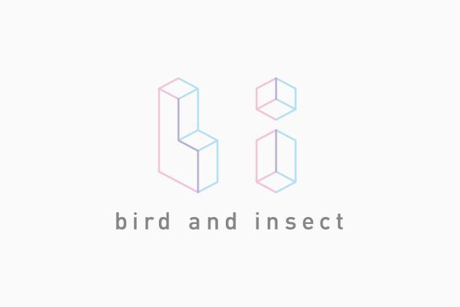
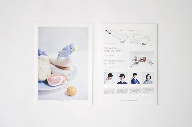
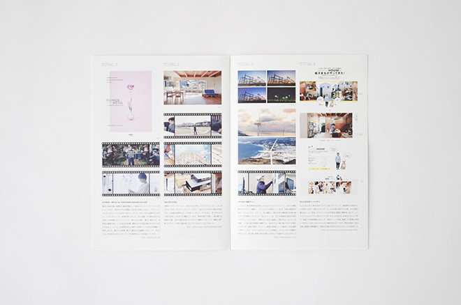
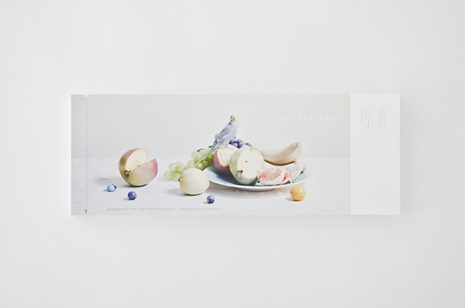
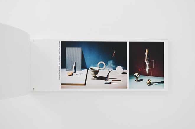
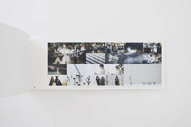
写真・映像の制作を主体とするクリエイティブカンパニーbird and insectのブランディングデザイン。
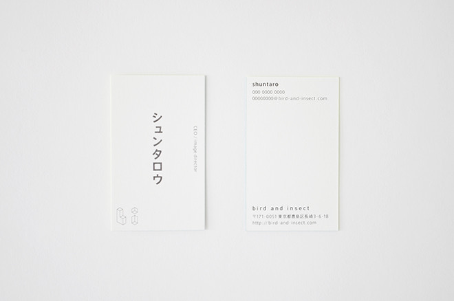
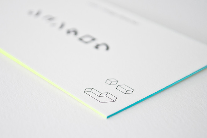
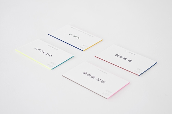
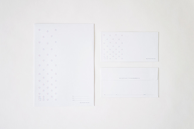
「多角的な視点を持つ」ことを表現したロゴはbとiでその視点が異なります。エッジに色がついたロゴに
合わせて、名刺のエッジにも色が付けられています。これはメンバーごとに異なる色になっており、
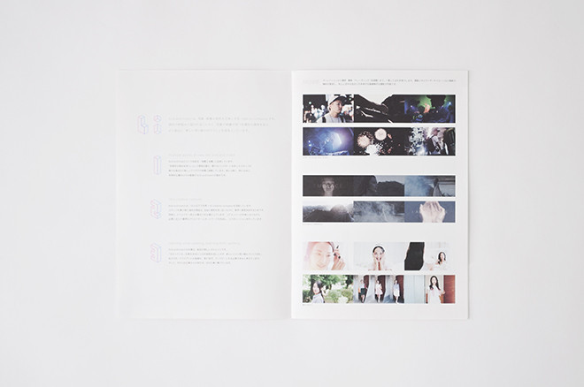
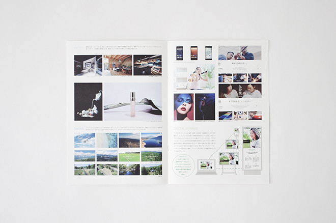
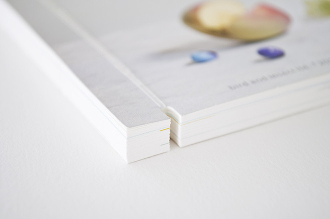
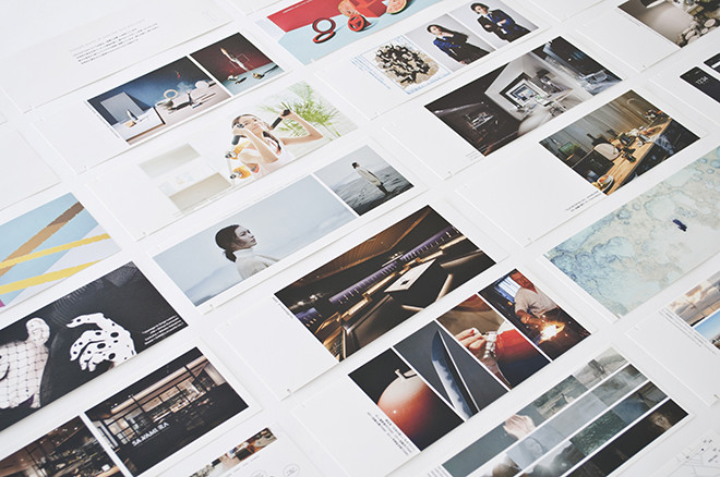
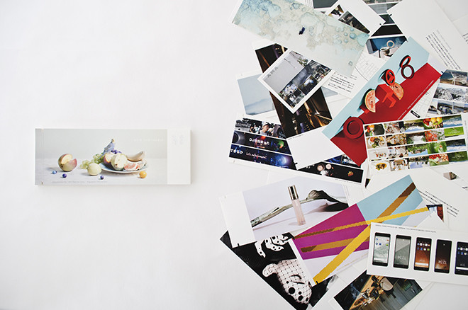
バックボーンの多様性とカジュアルなイメージを体現しています。作品集はゴムバンドで留められる形式で、
作品の入れ替えが簡単に行えるよう考えました。
2017年1月〜
クライアント:bird and insect ltd.
アートディレクション:小栗誠詞 (株式会社イド)
グラフィックデザイン:大木陽平 (株式会社サイド)
写真:小栗誠詞 (株式会社イド)
Branding design of creative company bird and insect, which mainly handles
the production of photographs and images. To express "diversified perspectives"
in the logo, b an i have different viewpoints. According to the logo with color on the edge,
the edges of the business card are also colored. Each member has different color, which
embodies the diversity of their skills and backgrounds and casual lifestyles. The portfolio is a form
that can be fastened with a rubber band that allows to easily replace the collection of works.
DATE:From Jan, 2017
CLIENT:bird and insect Ltd.
ART DIRECTION:Seiji Oguri (id inc.)
GRAPHIC DESIGN:Yohei Oki (side inc.)
PHOTOGRAPHS:Seiji Oguri (id inc.)
