inout
Branding design for inout, a one-stop service for video production. We designed the logo, business cards and stickers.
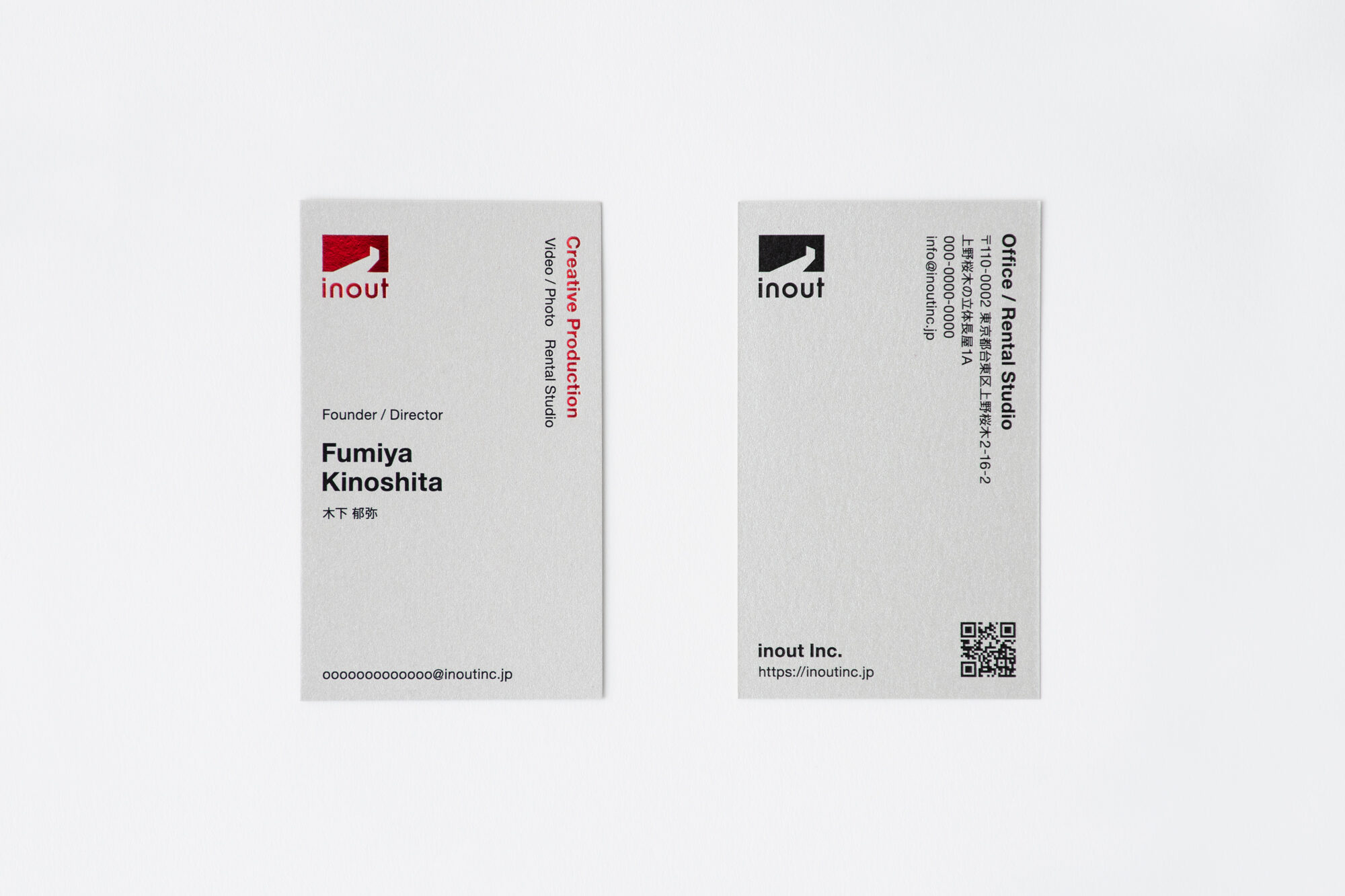

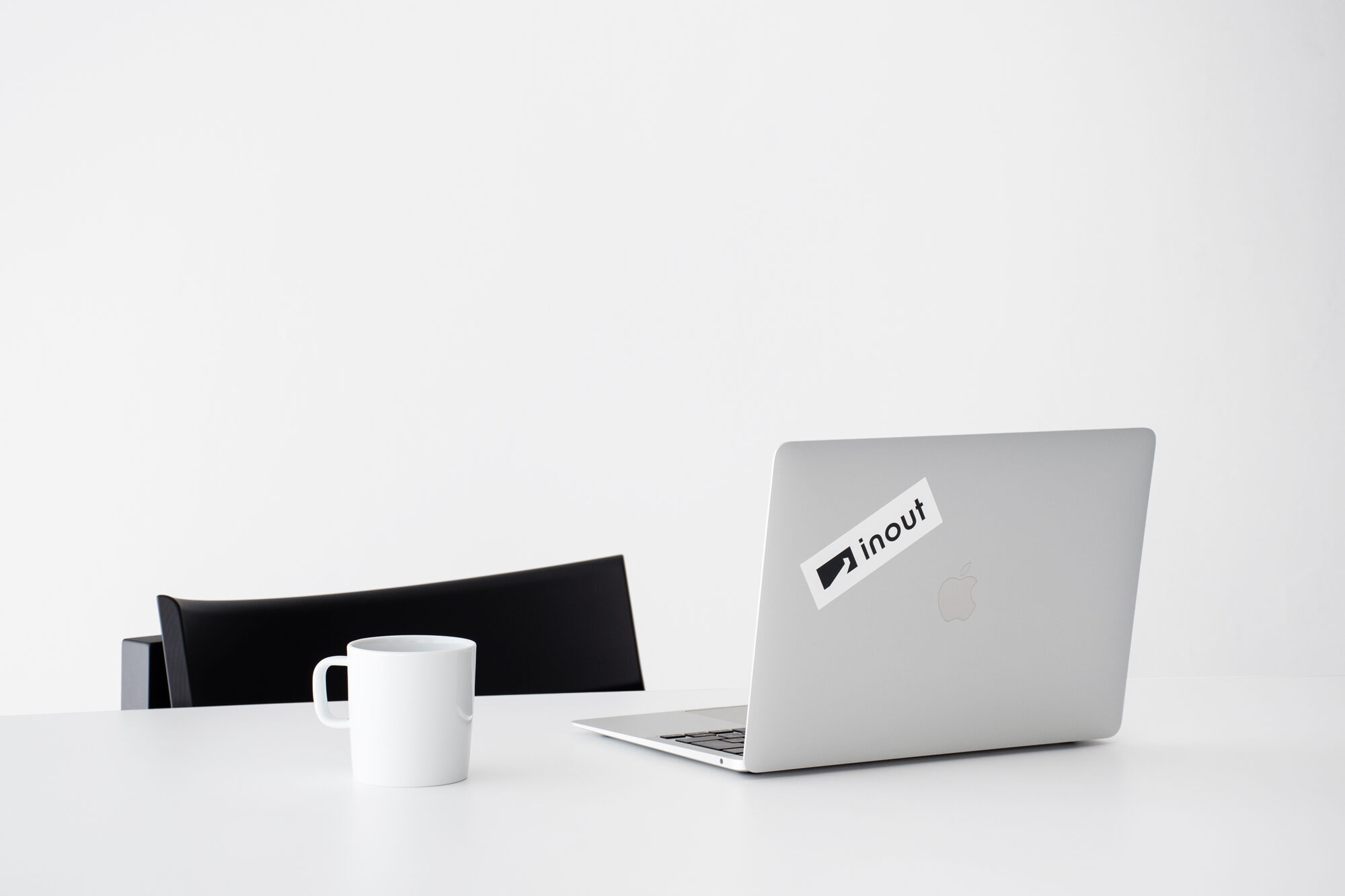
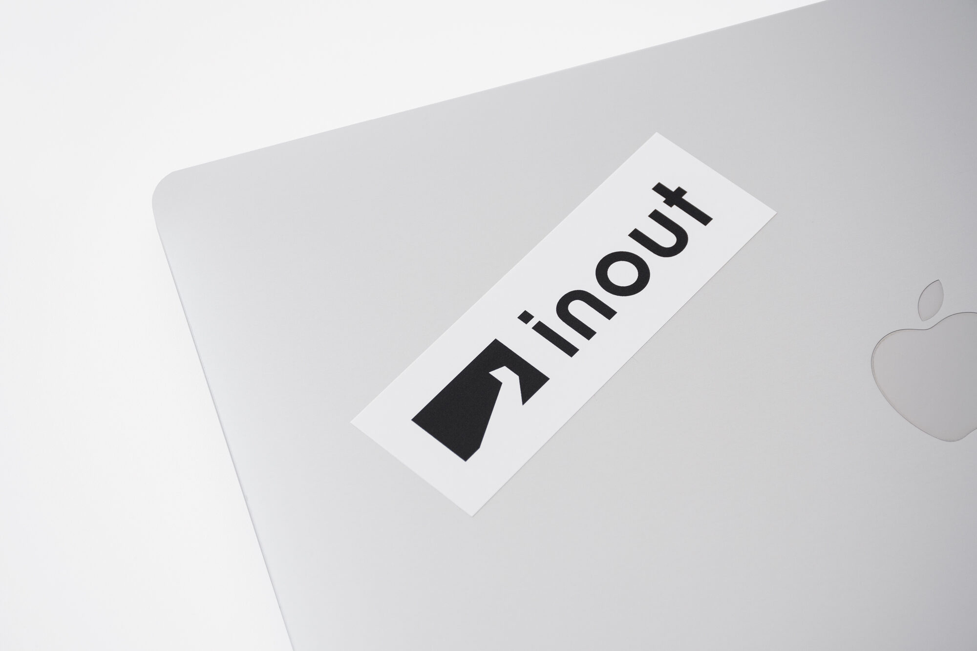
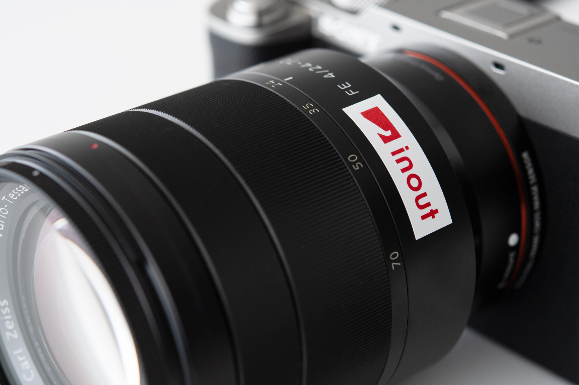
The logo was inspired by the origin of the company name, which represents the continuation of “input” and “output” in order to achieve better creativity. The logotype uses the same shaped “n” and “u” inverted to express that “input” and “output” are two sides of the same coin. The symbol mark is based on a 16:9 rectangle that evokes images, with light streaming in through an opening resembling the double doors of a movie theater. We expressed a space filled with light, born from “input” and “output,” inspired by the feeling of light streaming in when inspiration strikes, and the image of making a client or project shine.
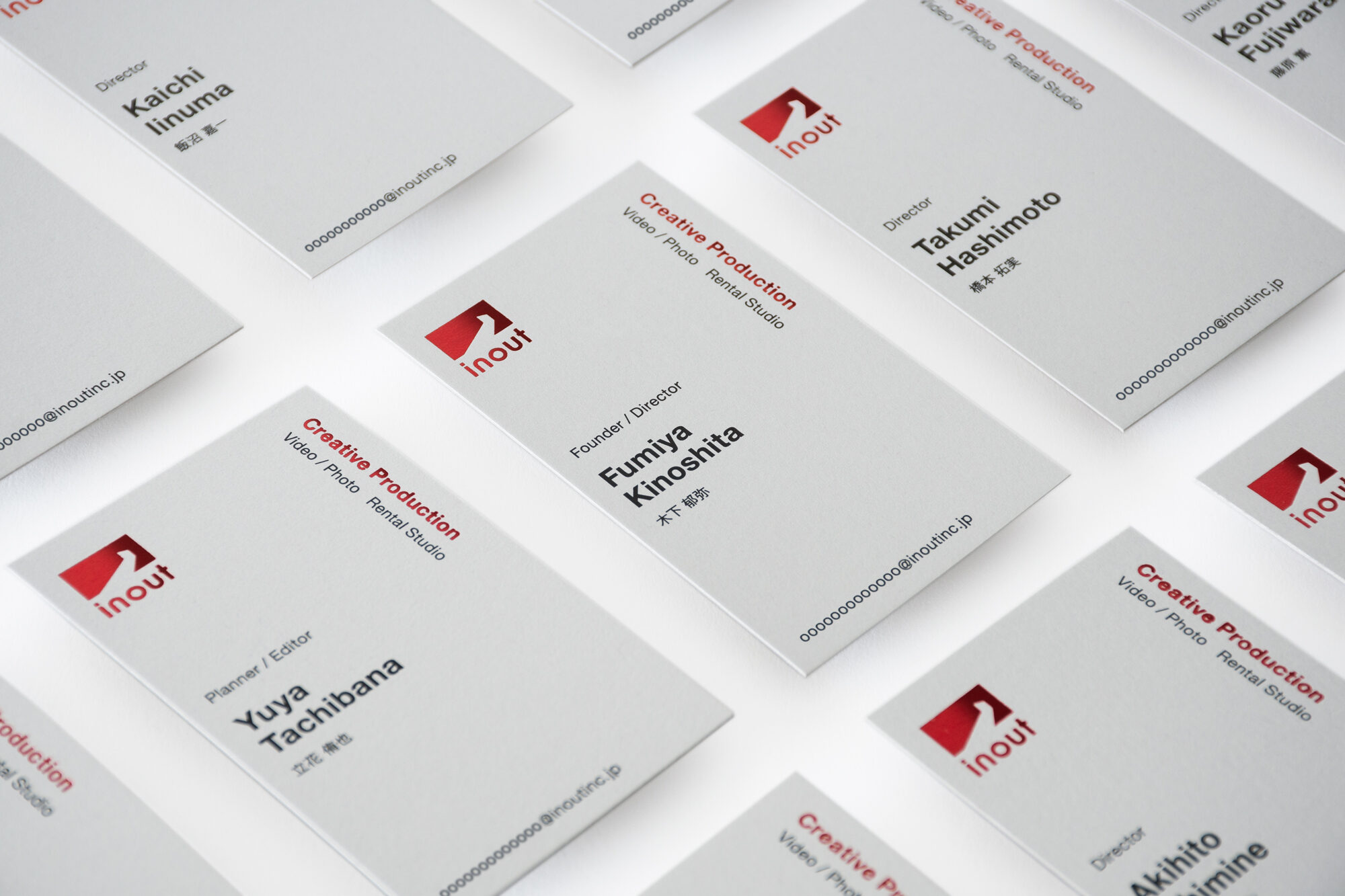
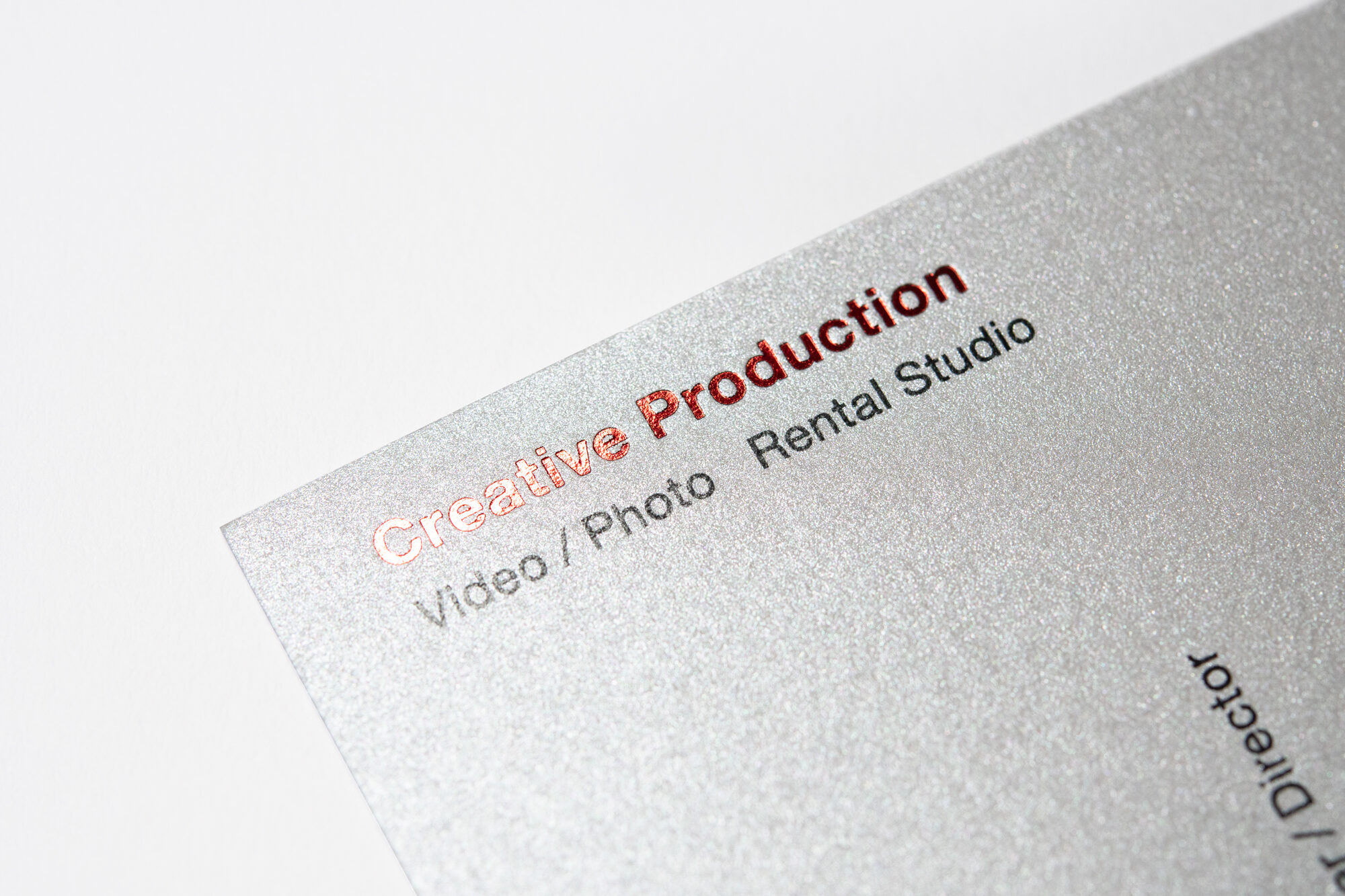
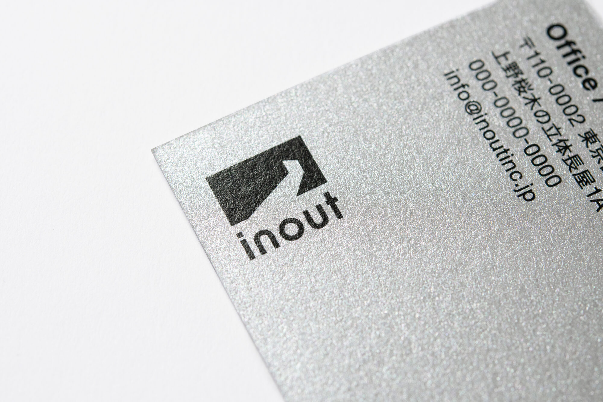
The business cards are made from grey pearlescent paper that has shiny particles that appear and disappear depending on the angle. The logo is then foil-stamped in a glossy, bright red, giving the entire business card a texture that radiates light.
2024–
CLIENT: inout Inc.
ART DIRECTION: id inc. (Seiji Oguri)
GRAPHIC DESIGN: id inc. (Mei Shibuya)
PHOTOGRAPHY: id inc. (Seiji Oguri)