38℃
Branding design for the music production team 38℃. We designed the logo, business cards and envelopes.
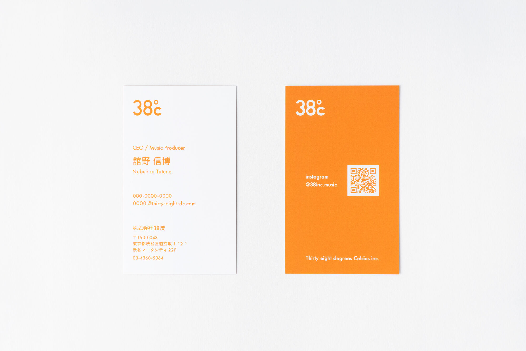
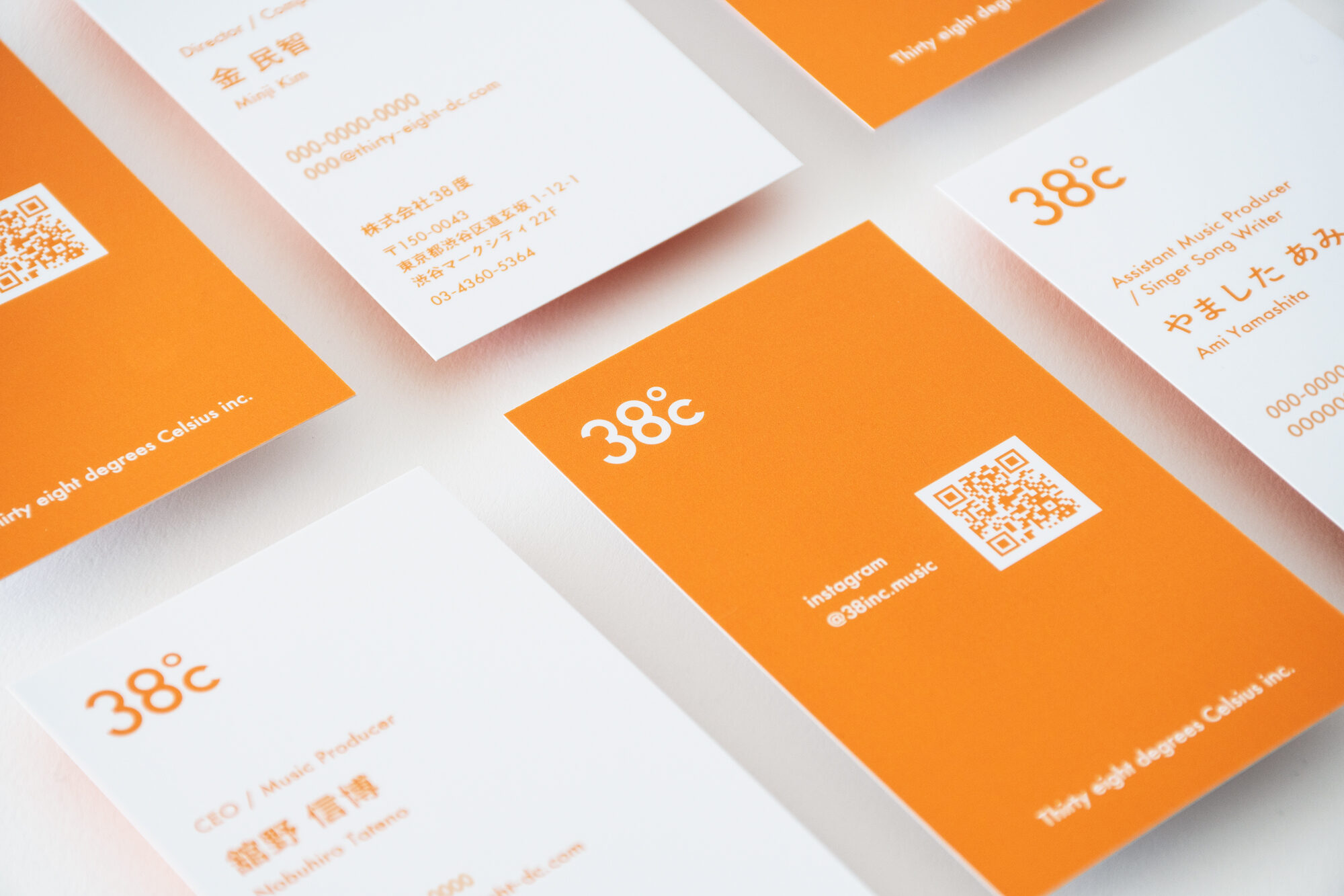
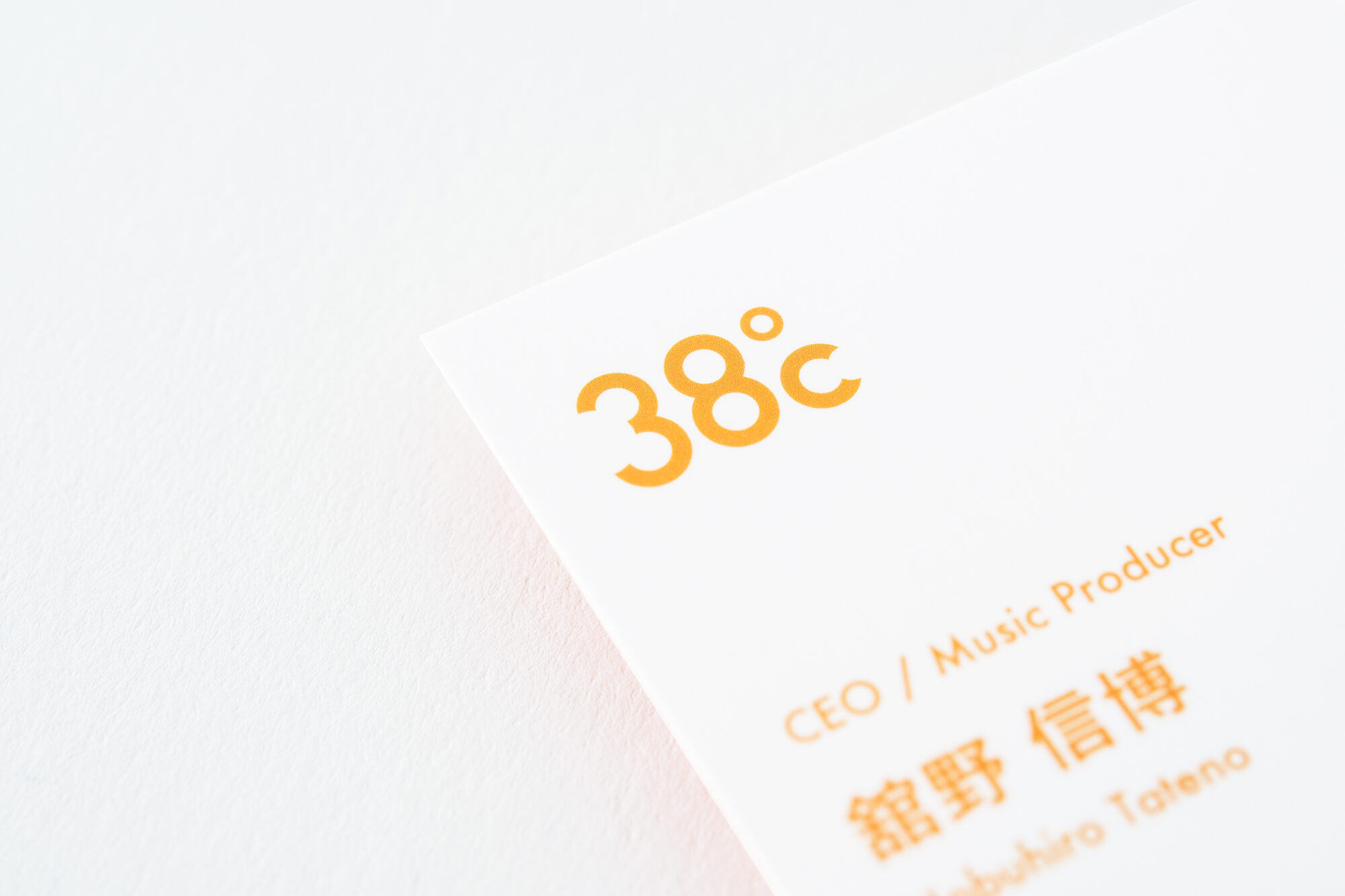
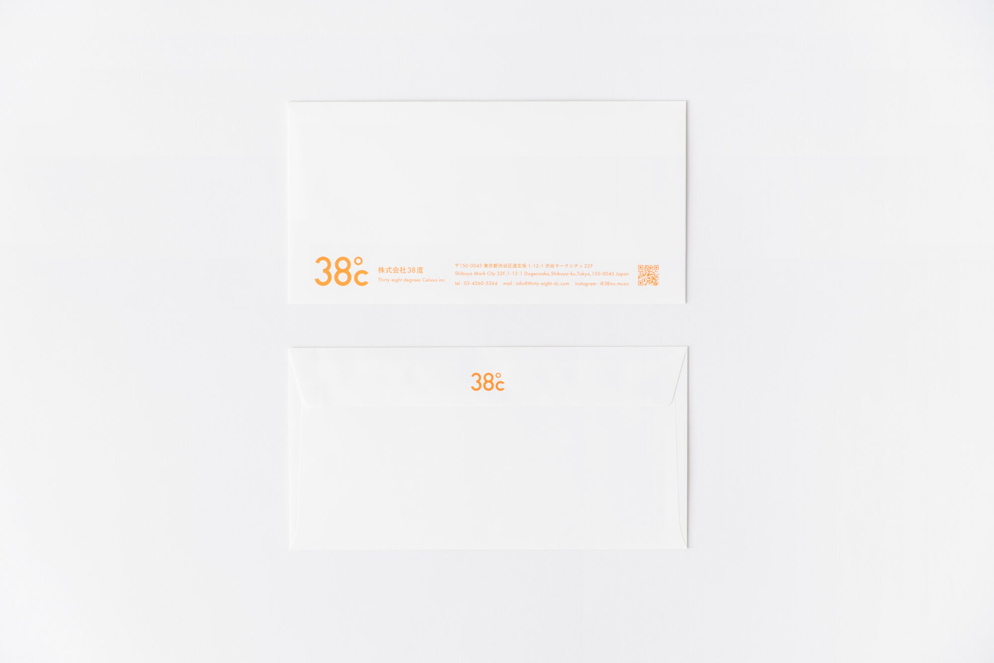

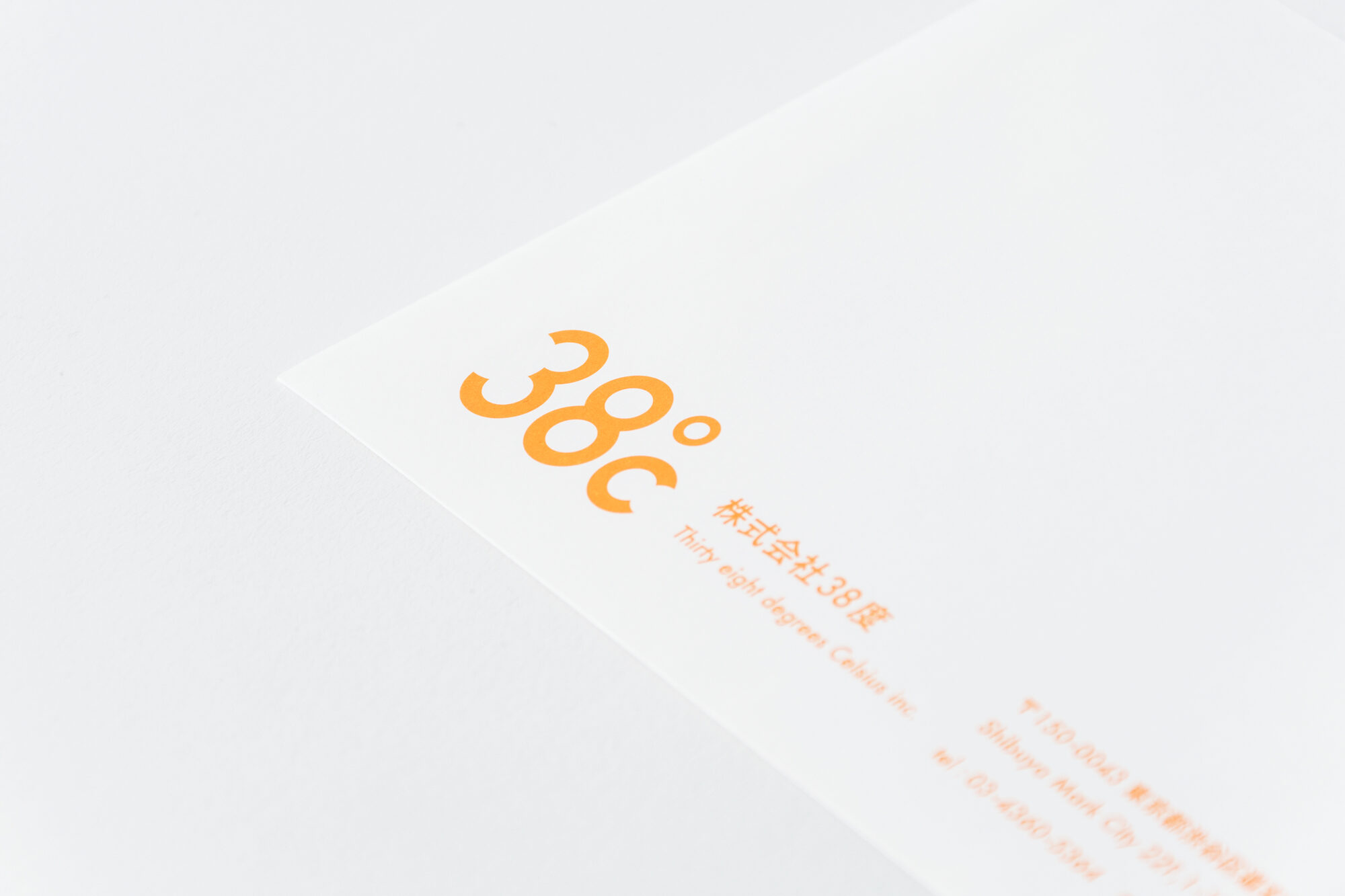
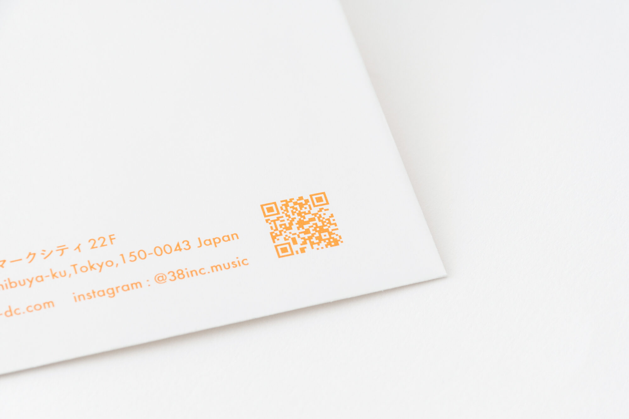
The logo is a graphical interpretation of the distinctive company name. Everything is made up of circles, with the number “3” being made by cutting out part of the number “8” and the letter “C” being made by cutting out part of a circle. The edges of the cut edges are slightly pointed, giving the knife a unique look while also conveying a sharp cutting edge. By organizing and communicating the characteristics, we have created a logo mark with a strong appeal. The business cards effectively use the color orange, which is reminiscent of slightly warmer body temperature, and create a path to a QR code that encourages listening.
2024–
CLIENT: Thirty eight degrees Celsius inc.
ART DIRECTION: id inc. (Seiji Oguri)
GRAPHIC DESIGN: id inc. (Ayaka Tsuda)
PHOTOGRAPHY: id inc. (Seiji Oguri)