


写真事務所のブランディング
Branding design for photographer
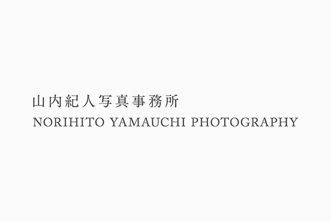
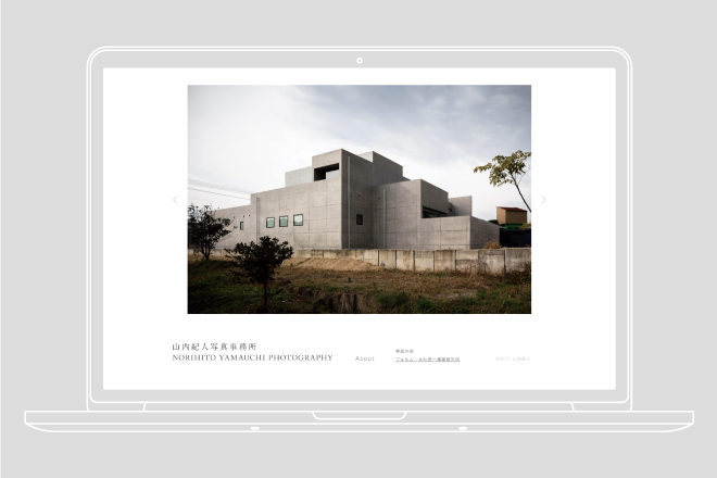
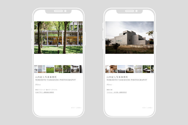
建築写真を主体として活動する写真事務所のブランディングデザイン。
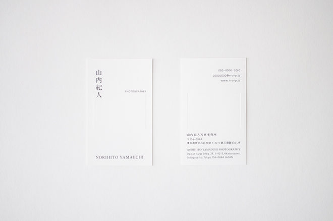
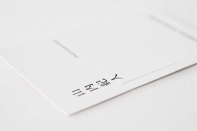
中央に矩形のエンボス加工を施した名刺は、受け取る方の想像力で様々な解釈が出来るような
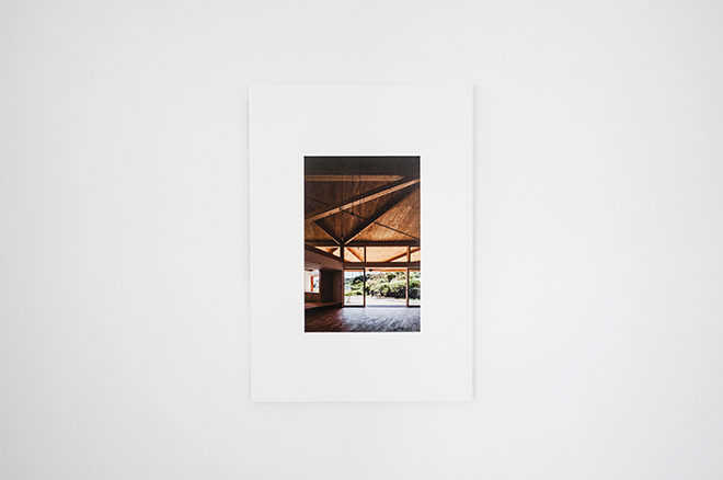
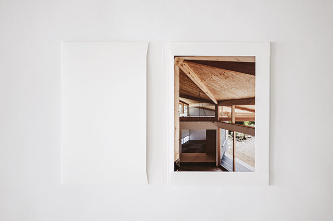
余白のあるデザインです。また、写真を納品する為の箱は、そこに収められた写真が表紙にも現れ、
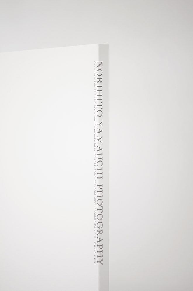
その建築の写真集のようにも見える作りになっています。写真事務所名の表記は、背表紙から裏表紙に
かけての角に配置し、本棚に並んだ時にも主張しすぎないように配慮したものとなっています。
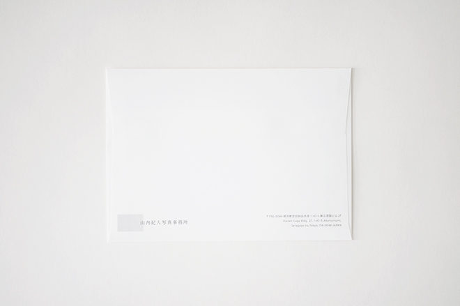
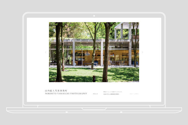
ロゴマークからウェブサイトに至るまで、全てのグラフィックは控えめでありながら、慎重に検証を
重ねたバランスになっており、その全ては写真事務所の写真や仕事に対する姿勢を表現したものです。
2016年5月〜
グラフィックデザイン:小栗誠詞 (株式会社イド)
写真:小栗誠詞 (株式会社イド)
Photographer’s website
Branding design of photographer, which mainly works on architectural photography.
A name card with a rectangular embossed center is the imagination of the recipient
It is a design with a margin that can be interpreted in various ways. In addition,
the box for delivering photos, the photos contained in it appear on the cover,
It looks like a photo book of that architecture. The notation of photographer’s
name is placed at the corner from the spine to the back cover. All graphics, from
logos to websites, are discreet but carefully validated. They are all photographers'
attitudes towards work.
DATE:From May. 2016
GRAPHIC DESIGN:Seiji Oguri (id inc.)
PHOTOGRAPHS:Seiji Oguri (id inc.)
Photographer's website
